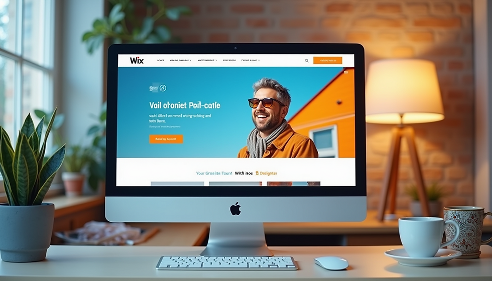
Elevate Your Brand with a Cohesive Visual Identity
- Nadia Pompilio

- Apr 22
- 4 min read
Updated: Jun 14
Creating a strong visual identity is essential for any business. It’s not just about looking good; it’s about making a lasting impression. In this post, we’ll dive into the importance of visual identity alignment and how to achieve it effectively.
Why Visual Identity Alignment Matters
Visual identity alignment means using consistent design elements across your website and other online platforms. This consistency helps visitors instantly recognize your brand and feel confident in your professionalism. Here’s why it matters:
Brand Recognition
Consistent use of your logo, colors, and fonts makes your brand easier to remember. When visitors see the same visual cues repeatedly, they associate those elements with your business, which strengthens brand recall.
User Experience
A website with aligned visual identity feels cohesive and polished. This clarity helps users navigate your site more easily and reduces confusion. When design elements clash or feel random, visitors may question your credibility.
Emotional Connection
Colors and typography evoke emotions. Aligning these elements with your brand personality helps create the right mood and tone, making your audience feel connected and engaged.
Integrating Your Logo into Your Website Layout
Your logo is the cornerstone of your visual identity. It should be placed thoughtfully to reinforce your brand without overwhelming the design.
Positioning
Place your logo in the top left corner of your website header. This is where visitors expect to find it, and it naturally draws the eye when the page loads.
Size and Clarity
Ensure your logo is large enough to be recognizable but not so big that it dominates the page. Use high-resolution images to keep it crisp on all devices.
Clickable Logo
Make your logo clickable, linking it back to your homepage. This improves navigation and user experience.
Consistent Usage
Use the same logo version across your website and other online channels. Avoid mixing different logo colors or styles that can dilute your brand identity.
Choosing and Applying Your Color Scheme
Colors influence how people feel about your brand. Selecting and applying your color scheme consistently creates a unified look.
Primary and Secondary Colors
Choose a primary color that reflects your brand’s personality and a few secondary colors to complement it. Use the primary color for key elements like buttons, links, and headings.
Background and Text Colors
Ensure there is enough contrast between background and text colors for readability. This also supports accessibility, which you can learn more about in our blog post on accessibility.
Color Psychology
Understand the emotions your colors evoke. For example, blue often conveys trust, while orange suggests energy and creativity. Align your choices with your brand values.
Consistent Application
Apply your colors consistently across all pages. Use your primary color for calls to action and highlights, and secondary colors for accents.
Selecting Typography That Reflects Your Brand
Typography sets the tone for your content and affects readability.
Font Choices
Pick one or two fonts that complement each other. Use one for headings and another for body text. Avoid using too many fonts, which can look chaotic.
Readability
Choose fonts that are easy to read on screens. Sans-serif fonts like Arial, Helvetica, or Google Fonts such as Roboto and Open Sans work well for body text.
Hierarchy and Consistency
Use font sizes and weights to create a clear hierarchy. Headings should stand out, while body text remains comfortable to read. Keep this consistent throughout your site.
Web-safe Fonts
Use fonts that display well across different browsers and devices to ensure your site looks professional everywhere.
Bringing It All Together in Your Website Layout
Integrating your logo, colors, and typography into a cohesive website layout requires thoughtful design.
Grid and Spacing
Use a grid system to align elements neatly. Adequate spacing between sections and around text improves readability and visual appeal.
Navigation Design
Style your navigation menu using your color scheme and typography. This reinforces your brand and helps users find information quickly.
Visual Balance
Balance images, text, and white space to avoid clutter. A clean layout highlights your visual identity elements without overwhelming visitors.
Responsive Design
Ensure your visual identity adapts well to different screen sizes. Test your website on mobile devices to maintain consistency and usability.
Enhancing Accessibility While Maintaining Visual Identity
Accessibility ensures everyone can use your website, including people with disabilities. Aligning your visual identity with accessibility best practices improves user experience for all.
Use sufficient color contrast between text and backgrounds.
Avoid relying solely on color to convey information.
Choose legible fonts and provide adjustable text sizes.
Structure content with clear headings and logical flow.
For more detailed guidance, check out our blog post on creating an outstanding Wix website, which covers accessibility features and design tips.
Why Professional Help Makes a Difference
Aligning your visual identity online can be challenging without design expertise. Professional designers understand how to balance aesthetics with usability and brand goals. They can:
Create custom logos and color palettes tailored to your brand.
Develop typography systems that enhance readability and style.
Build website layouts that integrate all visual elements seamlessly.
Ensure your site meets accessibility standards and performs well on all devices.
Tips for Women Entrepreneurs on Building a Strong Visual Identity
As a woman entrepreneur, your visual identity is your calling card. It tells your story and connects you with your audience. Here are some tailored tips to help you shine:
Be Authentic
Your brand should reflect who you are. Don’t be afraid to let your personality shine through your visual elements.
Stay Updated
Design trends change. Keep an eye on what’s current but stay true to your brand’s essence.
Seek Feedback
Don’t hesitate to ask for opinions on your visual identity. Sometimes, an outside perspective can provide valuable insights.
Invest in Quality
Quality design pays off. Consider investing in professional help if it’s within your budget. It can make a significant difference.
Take Your Visual Identity to the Next Level with nadiaOrangestudio
Your brand deserves a website that reflects its true identity and connects with your audience. At nadiaOrangestudio, we specialize in enhancing visual identity and website design to help your brand stand out online. Whether you need a fresh logo, a cohesive color scheme, or a complete website redesign, we bring creativity and strategy together to deliver results.
Ready to elevate your brand? Contact nadiaOrangestudio today and start building a visual identity that drives online success.